A great re-introduction of a storied LGBTQ+ publication.
A colleague in the Queer Design Club professional group reached out with a recommendation for a Pride Month project for Vox Media. What began as an introduction email to the creative director turned into a great conversation around queer identity, sports, branding, and scope negotiation. After a small portfolio review, I was selected by the creative director and the founders to refresh the identity of Outsports.com.
Credits: Phil Delbourgo (creative direction), Myself (concept, design, art direction), Krystal Jackson (PM)
The goal was to design an effective, modernized logo, and hand it off to the internal design team for application.
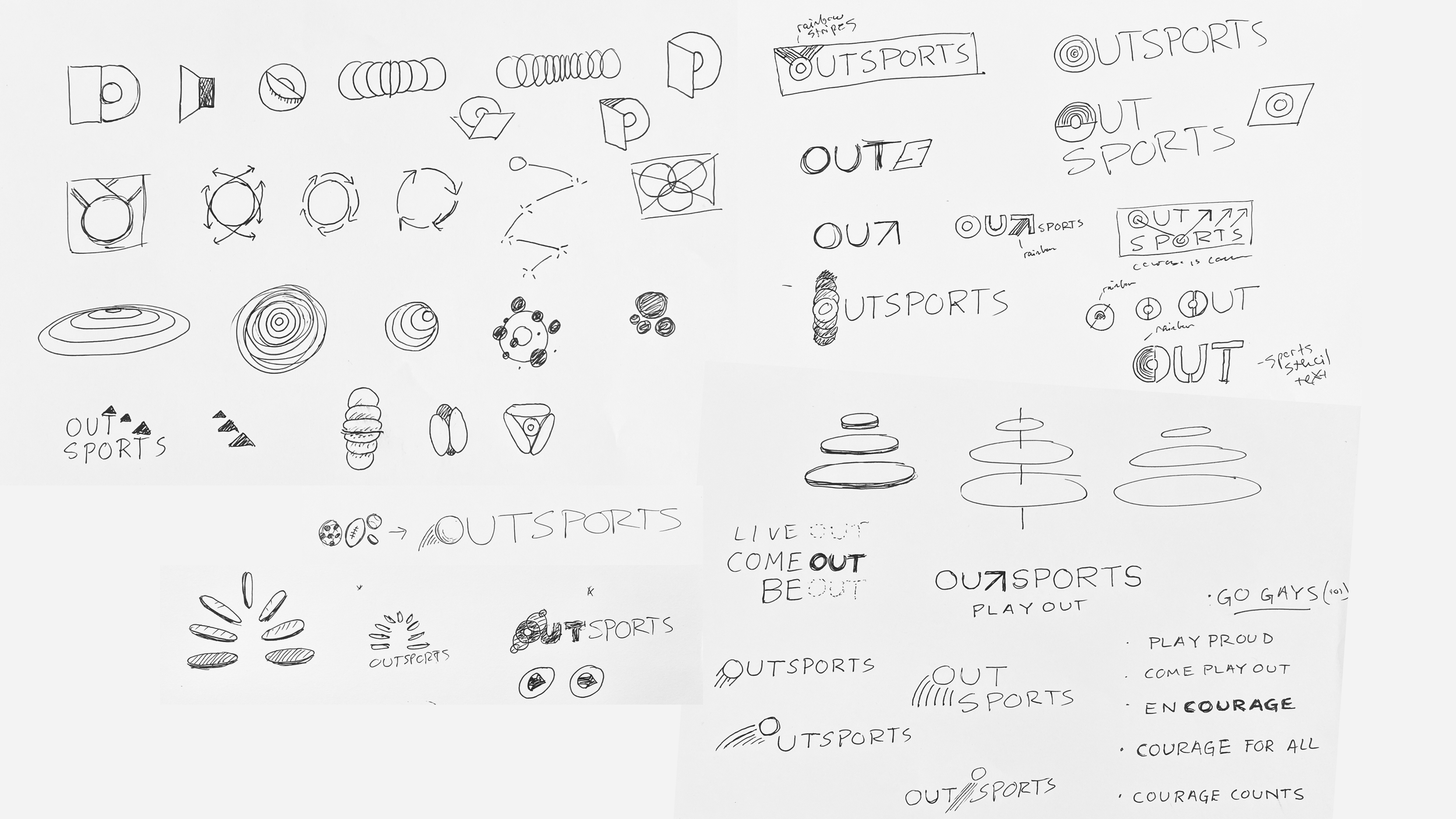
I began with a brand audit and research. The old identity was scarily literal, consisted of muted colors, unreadable, unscaleable, and forced into a home brand’s design system that it had lost all manner of inspiration in communicating who Outsports was trying to reach. I dug deep into the history of LGBTQ+ sports visuals, the history of our community, and modern design trends to present moodboards in which to take the brand.

History of Outsports brand identity

Coming Out

Pride

LGBTQ Sports history
Modern Branding
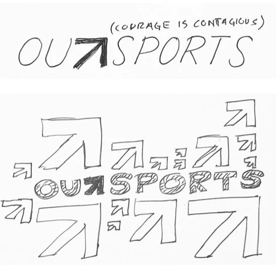
Initial sketches settled into a letterform
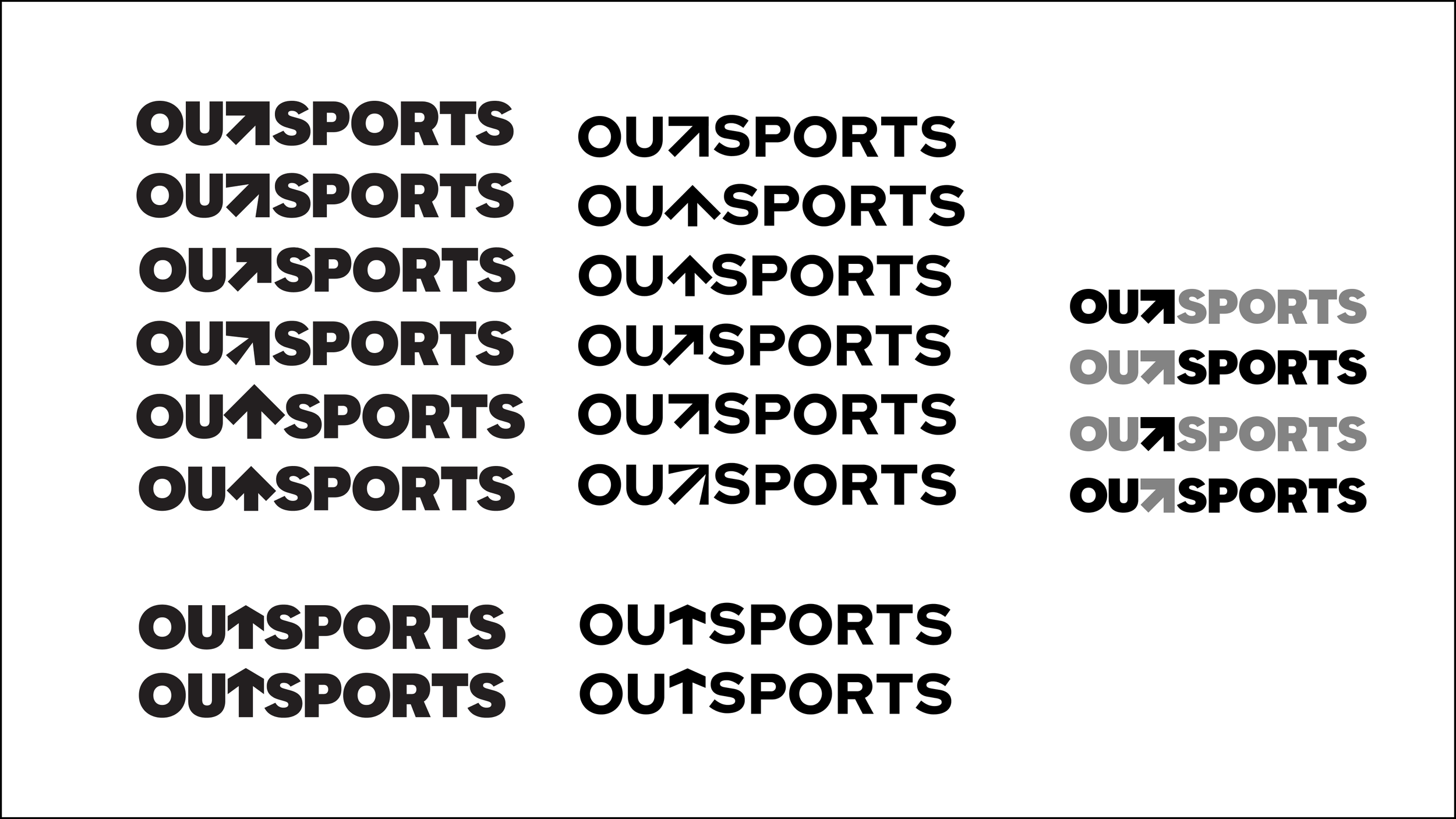
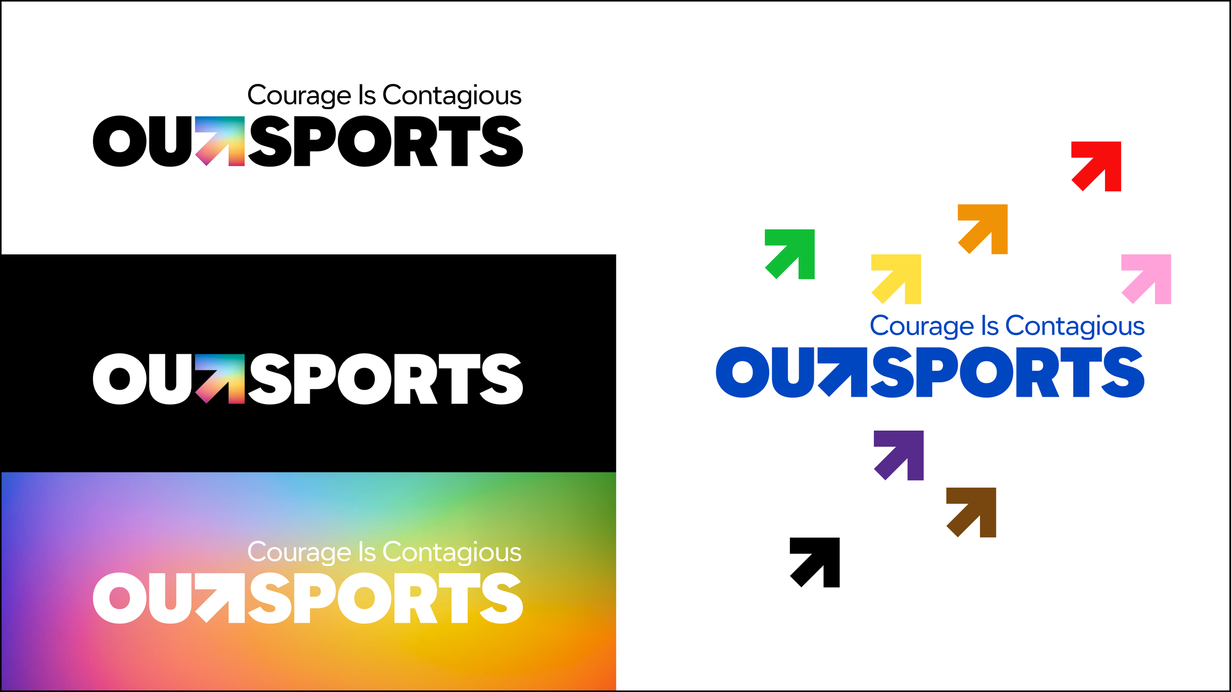
We settled on 3 concepts. Ultimately, Concept 2 was chosen for its simplicity, direction to the tagline resting on top of the logotype, and the ability to keep the name OUTSPORTS all together without reducing legibility. We moved into concept proofs and first renders. Truly, this was the most I’ve ever drawn an arrow in my life.


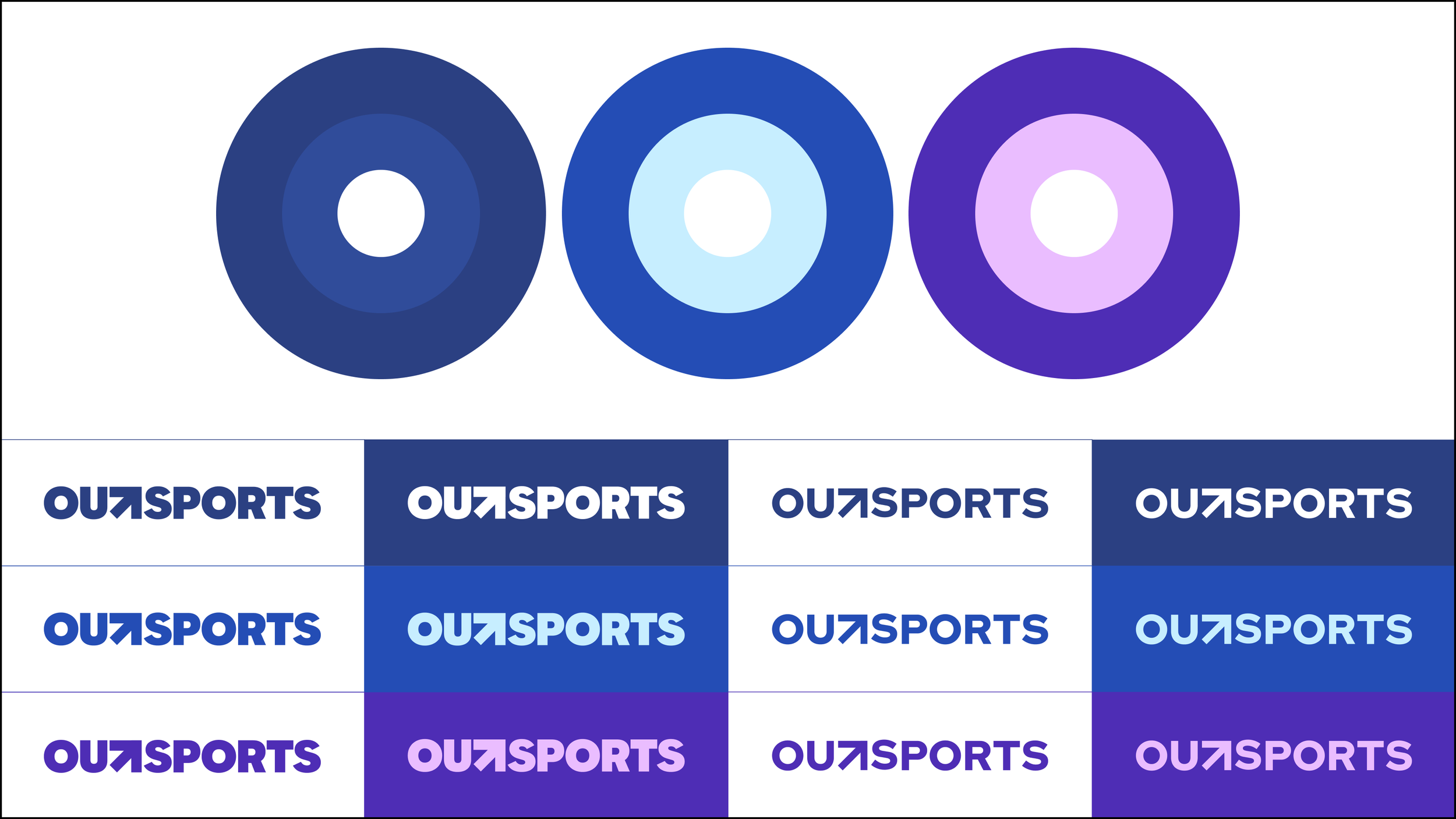
Logo and design system progression
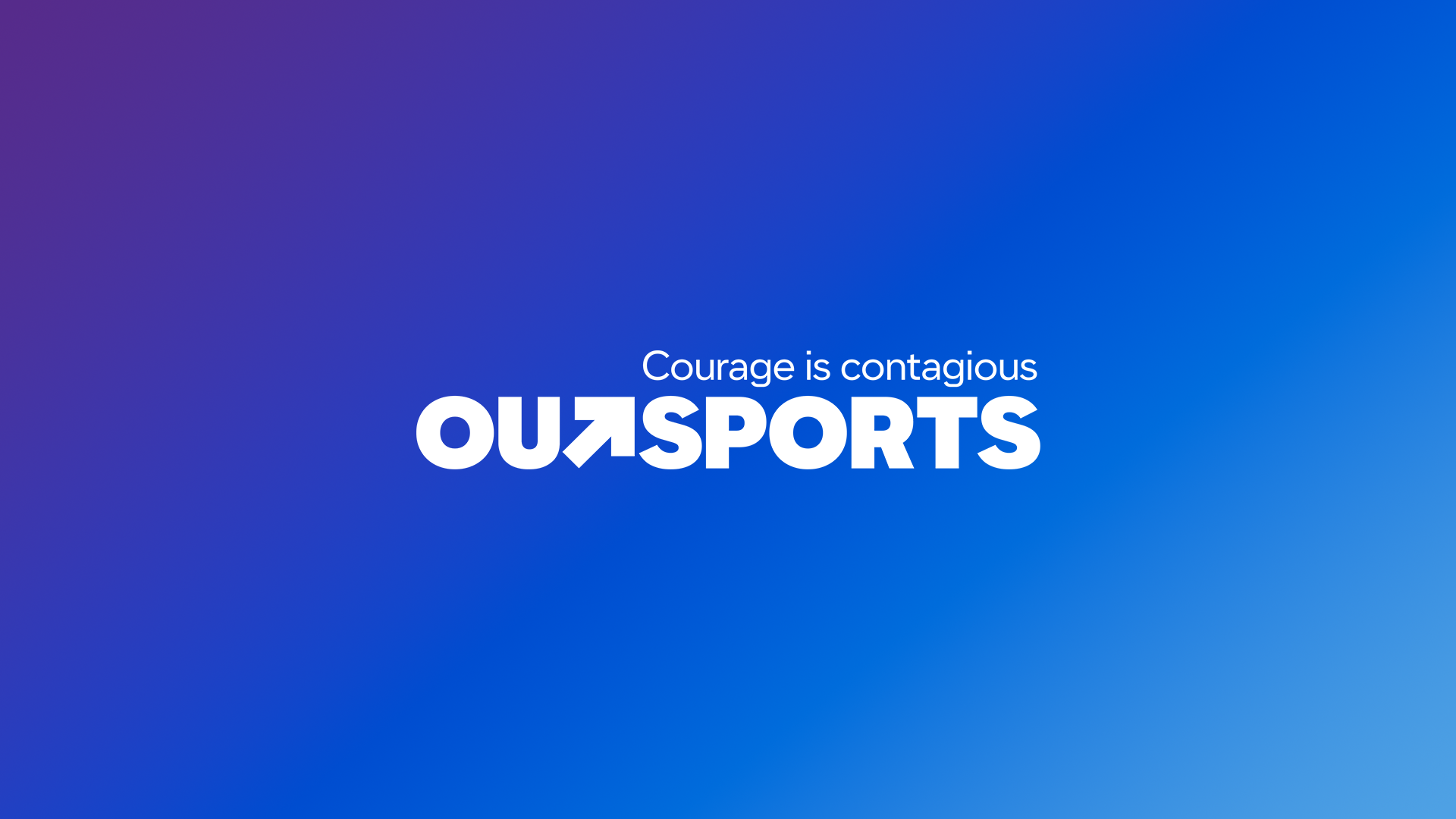
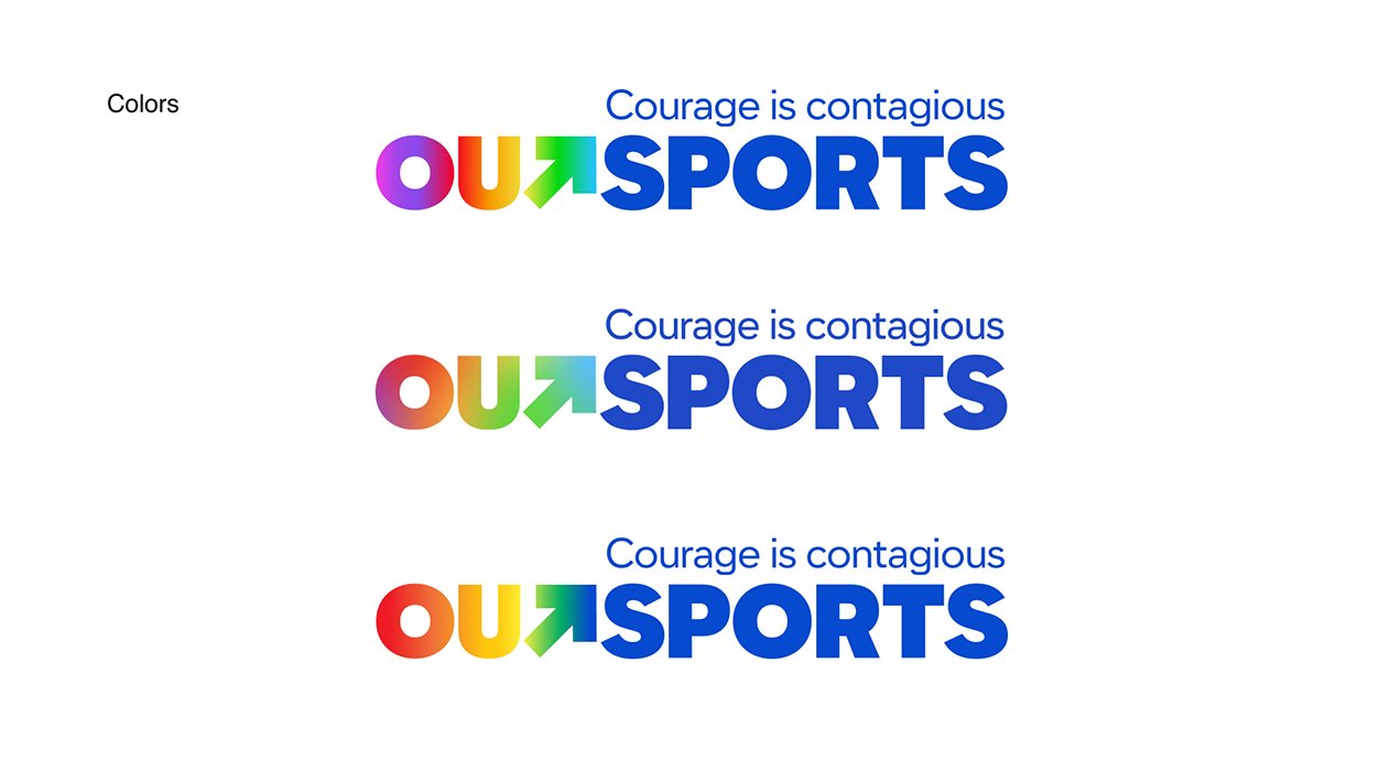
The final mark
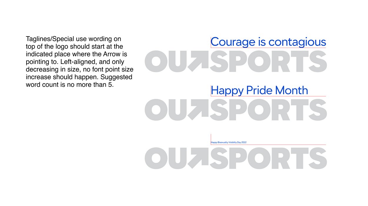
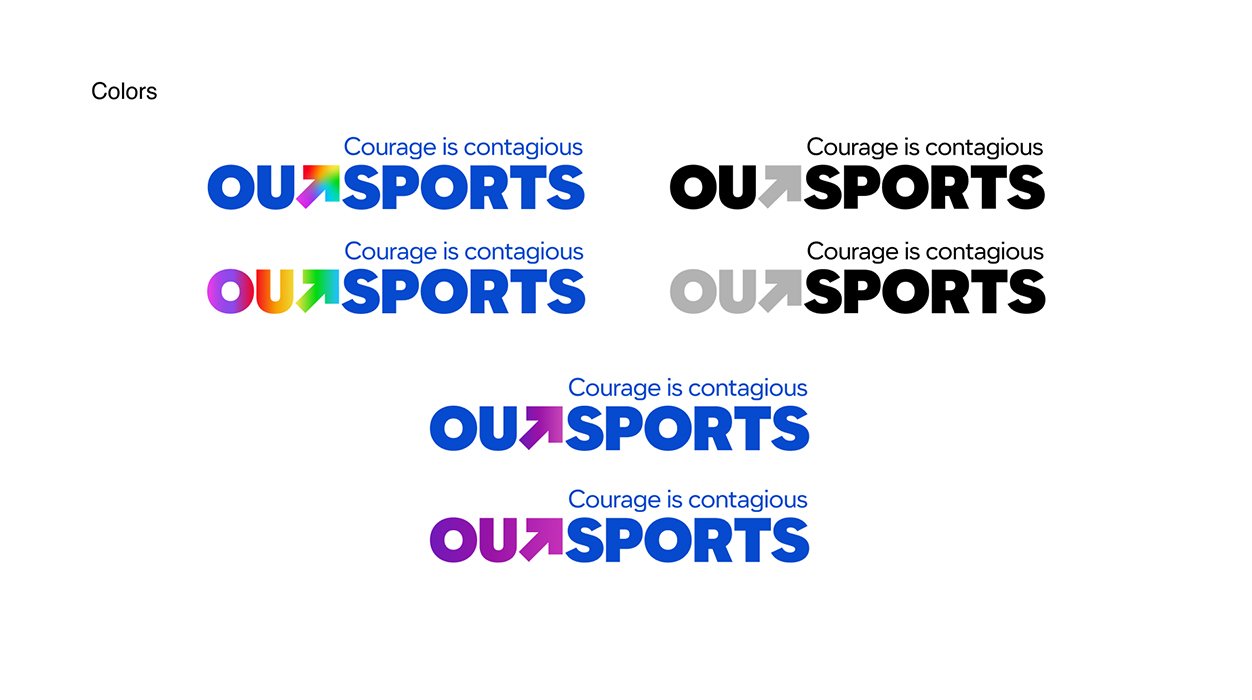
Set in Arrow Type’s Name Sans, I smithed the T into a hidden arrow representing the upward trajectory and forward momentum. I positioned the tagline as a visual interception point, for ease of reading left-to-right. Once approved, I moved to build the brand guides and a few examples of style usage.


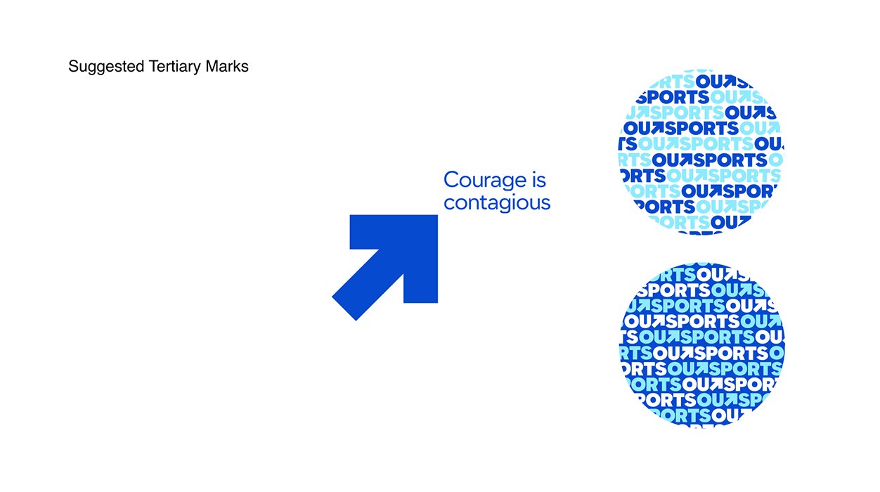


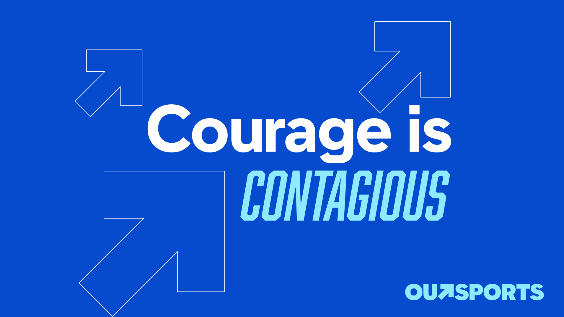


Digital applications
Learnings & Results
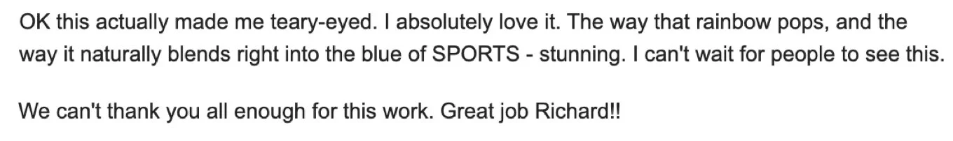
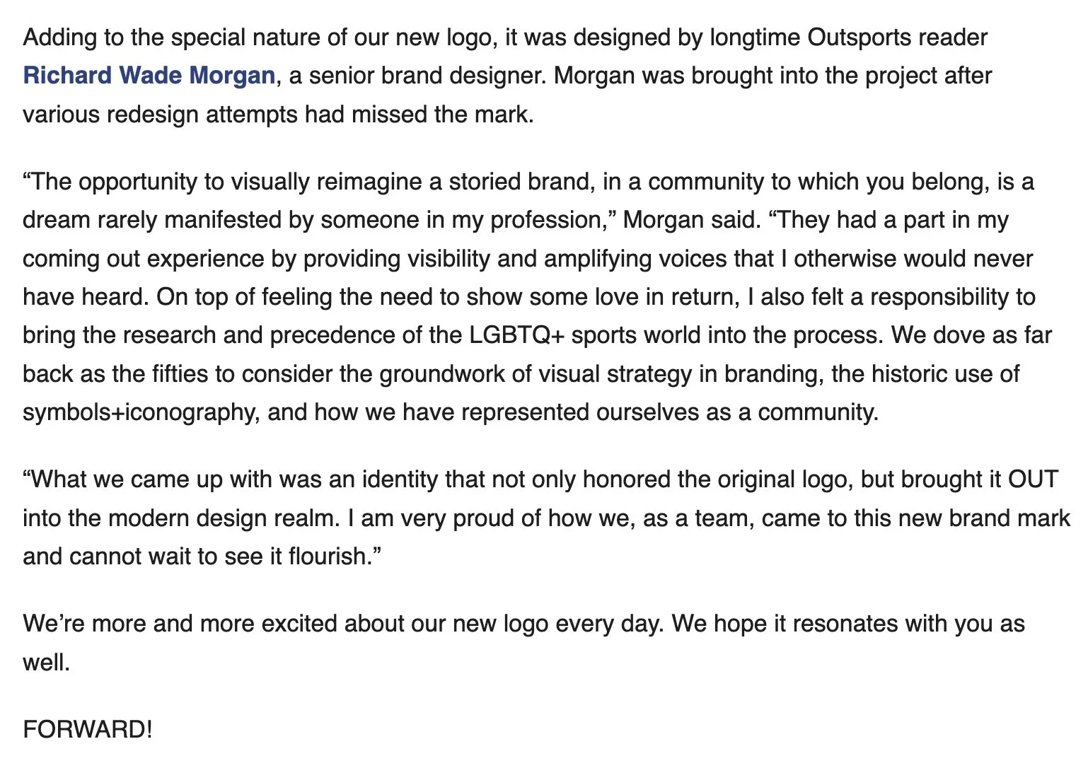
The rebrand received great acclaim. Positive reactions were heard from the founders, the publisher of SB Nation, many internal partners, Vox Media’s Chief Creative Officer, and plenty of fans online. This brand will be used for many years to come and brings a previously sidelined name out into the open. I also learned how to move nimbly and read the room to understand internal feelings towards design and creative solutions. Below is an email from the founder, and a mention in the launch article on Outsports.com.